Imagery
Imagery is how the brand feels before anyone reads a word. The right photo conveys our people, our work, and our culture; the wrong one fades into background noise. This page covers how to choose, treat, and label images so they earn their place on the page.


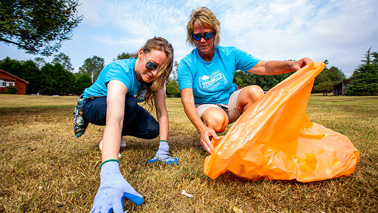

Associates at work — the kind of imagery this brand should lead with.
Lead with our associates
The most distinctive imagery we own is our people doing their work. Genuine moments — on the production floor, in the office, in the community — carry the brand farther than any stock photograph ever will.
Real work, real settings
On the floor, with the product. Genuine moments outperform staged stock photography every time.
Culture and connection
Show associates together, in the spaces that make our culture visible: quotes on the walls, hallways, shared moments.
Community impact
Volunteering, service, and the work that happens beyond the office is part of who we are. Show it.
Principles
Seven principles, in order from most to least common when imagery problems show up in review.
Lead with our associates
Whenever possible, use authentic photos of JM Family associates at work — smiling, engaged, in real settings. Our people, our culture, and our workplaces are the most distinctive thing we have to show. Stock photography is a fallback, never a first choice.
Match characteristics across images
When a layout uses multiple images, match their exposure, color tone, contrast, and crop style. One overexposed photo or one heavily filtered image breaks the cohesion of the whole page. The same applies to illustrations: keep palette, line weight, and detail level consistent.
Information beats decoration
Prioritize information-carrying images — product photos, real scenes, meaningful infographics — over decorative filler. Generic stock photos that appear on a thousand other sites add visual weight without informational value, and users learn to skip them.
Balance image with text
A page heavy with text needs imagery with detail and depth to hold attention. A page with lots of whitespace needs simpler, calmer imagery. Strip the words away from your design for a moment — the imagery alone should still convey the right tone.
Right size, right quality
Compress and resize before shipping. Aim for a total page weight under 1–2 MB. Use modern formats (
webporavif) for photos andsvgfor vector. Don’t sacrifice quality to the point of pixelation, but don’t ship a 4 MB hero on a phone either.Keep data visualizations honest
High data-ink ratio: every pixel should serve the data. Drop 3D effects, background textures, drop shadows, and decorative gradients. A clean bar chart communicates faster than an “exciting” one.
Write alt text that conveys content
For information-carrying images, the alt text should describe what the image communicates — not just what’s in it. For purely decorative images, use
alt=""so screen readers skip them.
Right size, right quality
Aim for a total page weight under 1–2 MB. Compress photos as webp or avif at 75–85% quality — almost always indistinguishable from the original at half the bytes.
Information beats decoration
When you choose between an image that tells the user something and one that just fills space, pick the first — every time.
Real, specific, ours. Shows our work, our people, and a moment that couldn’t come from a stock library.
Generic and replaceable. A photo that could appear on any company site adds nothing to ours. Skip it or replace it with something specific.
Alt text
Alt text describes what the image communicates — concisely, in the context of the page.
alt=“Two JM Family associates volunteering at a community cleanup, kneeling on grass and collecting trash into an orange bag.”
alt=“volunteering jm family associates community service stronger together volunteer event.”
Keyword stuffing for SEO. Useless to screen reader users.
alt=“Image of two people.”
Technically correct, completely useless. The image conveys far more than that.
alt="". If an image carries no information beyond what the surrounding text already says, an empty alt attribute lets screen readers skip it cleanly.